You are here
Amarok Insider - Issue 13
November 6, 2008 - 01:10 — ljubomir
Rok This Town
Welcome to the 13th (good it's not Friday) issue of Amarok Insider. On this happy day we prepared for you:

And, just for fun, take a look at how Amarok's interface evolved during its development:
Want more? Check out RaVI's fine Beta 2 screenshot tour. If you made some cool gallery too, let us know!
With the final version of Amarok 2.0 waiting around the corner, let's take a look at some of it's biggest features.
You can remove either of them by clicking the minus icon in the bottom left corner and selecting the particular applet you'd wish to remove:
Adding applets is just as easy. Click on a plus icon and select the applet:
When there is no enough space for the applet to fit into the current page, Amarok places it the next empty page. You can move between pages by using the arrow buttons or you can zoom out with the zoom button
  to see all pages at once:
Clicking on any page will focus Amarok back to it.
We have so many nifty plans for the future, you can read some of them on the Leinir's blog.
Here are some mirrors in case you for some reason prefer high quality ogg file instead of a blurry Youtube.
"Suppose you're really into music created around the "summer of love" in 1967. Its easy enough it create a filter so you only get music from 1967. We could do that in Amarok 1, but that excludes a lot of music around that period that's just as significant.
Maybe you could do something like asking for everything that's recorded after 1960 but before 1973. That's better, but it's still not really what you mean when you say around 1967. You would prefer tracks closer to 1967 than farther away.
This is where "fuzzy biases" come in. The goal with fuzzy biases, is create a playlists that approximately match a value. Generating biased playlists, is always a question of probability distributions. What we are really trying to do here is generate a playlist that fits normal distribution bell-curve."
Read the rest of the article on the Daniel's blog.

Another good example are the "Cool Streams" and "LibriVox.org" scripts which are actually a fully featured services. The first one gives you the access to the hand picked radio streams, while the second one integrates the whole Librivox.org catalog with Amarok letting you enjoy the rich selection of audiobooks right from your favorite player. And all that using only "few" lines of (scripted) code.

The downside of the new service API is the inability to run old scripts anymore, and the only solution is to port them to QtScript. Fortunately, there's a nice HOWTO describing the process of creating a (new) script for Amarok.
Amarok also continues to support the HotNewStuff platform which helps you to distribute your script to the users with virtually no effort. Just upload it to kde-apps.org, and it'll be available for download from within Amarok itself.


"Today on IRC a user asked the following question: "Is there a list of 1.4 features that are still missing in Amarok 2?"
As this question comes up rather frequently, I will try to shed some light on this topic here. First of all we have to make the following clear:
Not all of Amarok 1.4's features will necessarily return in Amarok 2. Many features will be ported over, a lot of new features will be added, and some old features will simply be dumped for good. Amarok 2 isn't simply a souped up version of Amarok 1, but it's almost completely a new program, and you can't expect it to work exactly like 1.x. If we wanted that, we could simply have taken 1.x and stuck a big "2.0!" logo on it, and be done with it. " Read on.
We are also running a fund raising campaign traditionally named Roktober 2008. Besidesfilling our pockets ensuring Amarok's growth, every 10 euros pieces of currency donated gives you one entry in the drawing for an iaudio7. Cool.
Welcome to the 13th (good it's not Friday) issue of Amarok Insider. On this happy day we prepared for you:
- Release plans
- Final look for 2.0
- Context View
- The Playlist
- Brand new PopUp Dropper
- Web services unmasked
- A bit about Biased playlists
- Scripting
- Mac OS X and Windows installers
- Features missing in 2.0
- How to help
- Cool tips: Two roks
Release plans
As you have probably noticed Amarok is currently in "release mode". We have released two alphas and three beta versions in the past few months, with the last beta released two days ago. Take your time and test it thoroughly so we can fix the remaining bugs for the final version which should be ready soon. Yes, you read it right, Amarok 2.0 is knocking at your door (although we may slip an RC or two ;)). If you're interested in helping out, we could use some regression testing.Final look for 2.0
After many revisions of the Amarok look, we have finally settled on the theme used for version 2.0. Thanks to Nuno Pinheiro and Lee Olson from the Oxygen team for helping with the artwork! Some minor tweaks remain to be done, but the general look won't change for 2.0. Any constructive criticism is appreciated. This is how Beta 3 looks like:
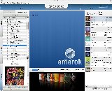
And, just for fun, take a look at how Amarok's interface evolved during its development:
 Original splash screen. Sparkled overly enthusiastic reactions. |
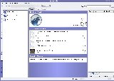 Beginnings of the UI refactoring. Central area still uses the old html engine. |
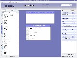 First version of the proper Context View. Later replaced by Plasma. |
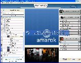 More work on the playlist. Still no plasmoids in Context View though. |
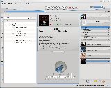 New artwork, working plasmoids. |
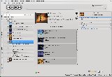 First beta. Amarok rocks. |
Want more? Check out RaVI's fine Beta 2 screenshot tour. If you made some cool gallery too, let us know!
With the final version of Amarok 2.0 waiting around the corner, let's take a look at some of it's biggest features.
Context View
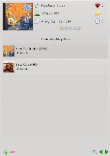
Central place of Amarok's window occupies the Context View, a Plasma powered information plane which displays all kind of useful information related to your music, like cover image, lyrics or ratings . Customizing it is a snap, as you can choose what information are you interested in form a wide selection of applets. All applets are grouped in pages, and you can manually assign applets to the pages, or let Amarok manage them for you. By default, Amarok shows one page with track information and albums by same artist:
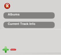
You can remove either of them by clicking the minus icon
 in the bottom left corner and selecting the particular applet you'd wish to remove:

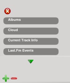
Adding applets is just as easy. Click on a plus icon
 and select the applet:

When there is no enough space for the applet to fit into the current page, Amarok places it the next empty page. You can move between pages by using the arrow buttons
 or you can zoom out with the zoom button
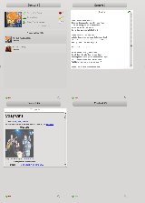
  to see all pages at once:

Clicking on any page will focus Amarok back to it.
The Playlist
Playlist widget in previous versions of Amarok with it's strict columns used a lot of horizontal space. In the new version it's replaced with a narrow bar which smartly combines much information yet still preserves space. Tracks from the same album are grouped together, and share cover image.We have so many nifty plans for the future, you can read some of them on the Leinir's blog.
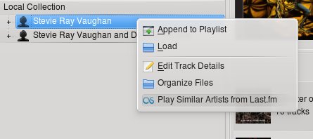
Brand new PopUp Dropper
Due to the data (collection, web, files) browsers and playlist widget being on the opposite sides of the window, one could presume that dragging the music around will be much harder job than before. But thanks to the wisdom of the Amarok's developers that's not the case. Application detects when the user starts dragging and pops up a full sized menu which offers actions like "append to the end of the playlist" and "load and play now". Dropping the files on one of the menu entries triggers the appropriate action, hence the name "PopUp Dropper". This behaviour is very smooth and unintrusive, and can be completely ignored by dropping the files directly to the playlist. The following video demonstrates the usage of PopUp Dropper in Amarok 2 Beta 2:Here are some mirrors in case you for some reason prefer high quality ogg file instead of a blurry Youtube.
Web services unmasked
Another part of Amarok where much work has been invested is the Web services integration. Now Amarok can connect to various Web services and access the music from there directly, enriching your music collection greatly. And thanks to the powerful API adding additional services can be done with very little effort. This has been covered in the Insider on previous occasions, but now is a good time to have a look at what will actually make it into the final 2.0.0 release. Lets take a look at services supported by Amarok 2.0 Beta 3:Ampache Service
It allows you to connect to the Ampache music server and use it like any other service, which includes browsing, searching, cover art display, and of course music playback. This is really cool, as it allows you to have one centralised server holding your perfectly tegged collection, and use Amarok as a frontend remotely, which is, kinda, best of the both worlds.Jamendo Service
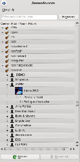
It gives you access to the Jamendo's rich database of independent artists.
Last.fm Service
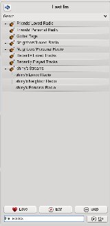
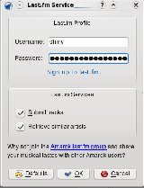
It's an advanced plugin which allows you to connect to the Last.fm web service. Via it's nifty inerface it offers a full access to the Last.fm's main features including those available for subscribers only. Besides usual ones like scrobbling and streaming it also has some nice little touches like special buttons on the toolbar and context menus.Magnatune.com Service
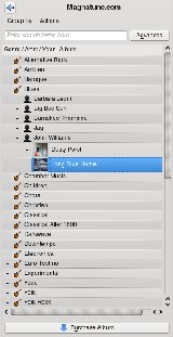
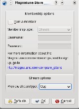
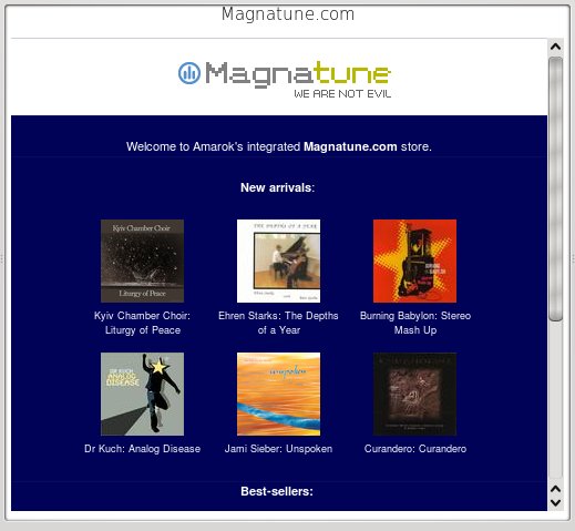
Magnatune.com is another advanced service which connects to Magnatune.com. It provides access to the entire Magnatune database, including browsing, searching and streaming. Albums can be purchased via SSL secured connection, after which they are available for download within Amarok (or their website). Magnatune is also a second service which provides custom buttons for Amarok, namely "Purchase" and "Find in Service". The first one lets you purchase the album of the track you are currently listening to, and the second one show you the artist that you are listening to in the browser. As an added bonus, any purchase made with Amarok will aid 10% of it's value to the Amarok development (while 50% goes to the artist, and only 40% to Magnatune). Nice. Recently, Magnatune.com started offering 2 different membership subscriptions that lets members either stream without interruptions at the end of each track, or freely download as many albums as they wish without paying for each one. Both membership options are fully supported in Amarok 2. If you for instance enter credentials for a download membership in the Magnatune service settings, the purchase buttons will all change to download buttons and any album can be downloaded without paying. Magntune.com also offers Amarok a 10% commission of the first membership payments if you sign up using Amarok or this link.MP3Tunes.com
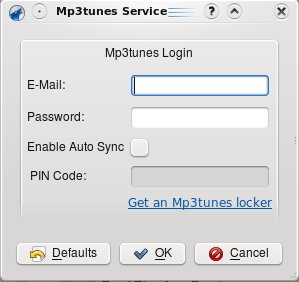
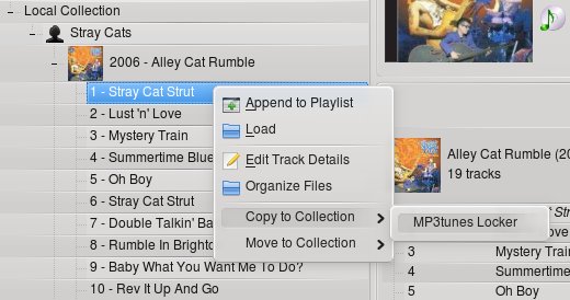
Thanks to this service you have access to your personal MP3Tunes locker from within Amarok. You can upload songs straight from the collection browser, or let Amarok keep your locker up to date automatically using the Auto Sync feature.

OPML and Shoutcast directories
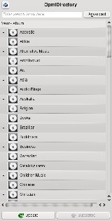
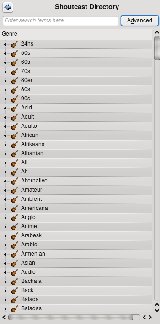
Those two services gives you access to their respective catalogs and let you browse, search and stream online music and subscribe to podcasts.

Scripted services
The list of available web services is impressive, isn't it? Well just hold on, because Amarok gives you more. Thanks to the redesigned scripting support and some brand new API hooks, it's possible to create your own service with a simple script! Head on to the Scripting section to read more about this.A bit about Biased playlists
Amarok is a home of many innovations, and features never seen in media players before. Remember the Wikipedia integration, automatic lyrics display, or the Moodbar? Now welcome the Biased playlists:"Suppose you're really into music created around the "summer of love" in 1967. Its easy enough it create a filter so you only get music from 1967. We could do that in Amarok 1, but that excludes a lot of music around that period that's just as significant.
Maybe you could do something like asking for everything that's recorded after 1960 but before 1973. That's better, but it's still not really what you mean when you say around 1967. You would prefer tracks closer to 1967 than farther away.
This is where "fuzzy biases" come in. The goal with fuzzy biases, is create a playlists that approximately match a value. Generating biased playlists, is always a question of probability distributions. What we are really trying to do here is generate a playlist that fits normal distribution bell-curve."
Read the rest of the article on the Daniel's blog.
Scripting
One of the nice features of the old Amarok, was the possibility for running external scripts, written in various scripting languages. It gave Amarok much flexibility and space for additional features but also had a few disadvantages. Amarok had more dependencies, external interpreters in general had a long startup time, and ultimately the user had to cope with many interpreters sitting in the memory. So the developers decided to switch to QtScript, a lean ECMAScript interpreter available at no expense to any Qt application. It's powerful, fast and has a very short load time. A good presentation of its possibilities is the Database Importer script, shipped with Amarok, which imports the old 1.4 database, including scores, labels and covers. Head on to Seb's blog to find more about it.
Another good example are the "Cool Streams" and "LibriVox.org" scripts which are actually a fully featured services. The first one gives you the access to the hand picked radio streams, while the second one integrates the whole Librivox.org catalog with Amarok letting you enjoy the rich selection of audiobooks right from your favorite player. And all that using only "few" lines of (scripted) code.

The downside of the new service API is the inability to run old scripts anymore, and the only solution is to port them to QtScript. Fortunately, there's a nice HOWTO describing the process of creating a (new) script for Amarok.

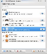
Amarok also continues to support the HotNewStuff platform which helps you to distribute your script to the users with virtually no effort. Just upload it to kde-apps.org, and it'll be available for download from within Amarok itself.

Mac OS X and Windows installers
Although not perfectly stable yet, builds for MacOS and Windows are live and kicking! There are still some kinks to work out before they get as good as the Linux version, but they keep getting better and better. Enjoy.

Features missing in 2.0
As you probably know, Amarok 2.0 is just the beginning of the exciting series of Amarok's development, so it's understandable that some of the old features might not be in the same shape as before. On the other side, some features were simply dropped. Having that in mind, to reduce the confusion our artist markey created a list of features you might miss."Today on IRC a user asked the following question: "Is there a list of 1.4 features that are still missing in Amarok 2?"
As this question comes up rather frequently, I will try to shed some light on this topic here. First of all we have to make the following clear:
Not all of Amarok 1.4's features will necessarily return in Amarok 2. Many features will be ported over, a lot of new features will be added, and some old features will simply be dumped for good. Amarok 2 isn't simply a souped up version of Amarok 1, but it's almost completely a new program, and you can't expect it to work exactly like 1.x. If we wanted that, we could simply have taken 1.x and stuck a big "2.0!" logo on it, and be done with it. " Read on.
How to help
Amarok 2.0 is in its late development phase, and it's a perfect time to help with testing! Grab your copy of Beta 3, and head on to bugs.kde.org with your reports. Regression testing needs some volunteers too.We are also running a fund raising campaign traditionally named Roktober 2008. Besides
Cool tips: Two roks
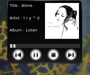
Plasma is all about clocks right? Well, we might get a media control widget as well. Or two, actually. Today we discovered two cool plasmoids, perfect for your KDE4 installation. If you still use old 'n stable Amarok 1.4 try plasma-am3rok, if you're a restless Amarok 2 tester head on to plasma-am4rok, and rok your desktop!
English
Stories:





Comments
am4rok
I'm the developer of am4rok. it doesn't work since you reworked the dbus api, and i've not updated it yet because i'm trying to get a way to go beyond the limits of the new api (e.g. get lyrics). but the last time i tried it the "now playing" plasmoid worked with amarok.
Well this issue took me
Well this issue took me longer to finish than I'd wish, and the last time I tried am4rok, it worked. Bummer.
I love Amarok 1.4. Its the
I love Amarok 1.4. Its the best music player for linux I know of because:
* you can manage a large music collection
* share the database with other users
But I am not sure what Amarok2 is.
I personally do not like it very much mainly because of the castrated database support - no support for a external PostgreSQL db anymore :-(
Or is it possible to share the embedded mysql database with other users by e.g. putting it onto an NFS-server?
On the contrary
Despite dropping support for external databases, Amarok 2 is much more efficient with managing large collections than 1.4 ever had. I guess mysql embedded is not that slow after all :). And the database sharing argument is moot too - Amarok 1.4 has not been designed to share it's collection database - it was was never officially supported. Amarok 2 on the other side features Ampache integration, a solution which was designed from the startup with multiple clients in mind.
Cheers
That's really bad! I don't
That's really bad! I don't want to have another database to worry about. I'm already using PostgreSQL for other purposes and administering one database is enough, not to mention the overhead of a second database running simultaneously and the extra disk usage (mysql goes crazy on the disk using gigabytes when PostgreSQL uses a few megabytes). And what about backups? I've had bad experiences with mysql I really don't want to loose all the information I have in my database.
Please, please, pretty please, reconsider that decision. What is the technical reason for dropping PostgreSQL anyway if you already had the code for it?
Splash Screen
HAHAH
Love the original splash screen. Can there be a compile option to get that one back?
UI critics
Come on, guys! Why so huge buttons? We're not blind. Please make them smaller and simpler (those round overlapping things are not looking good, believe me). I appreciate all your design work, but there is really more you can improve.
The play/stop and friends along with time line and volume control must be moved to the bottom. Imagine that amarok is minimized to tray and playing, you want to change volume or switch to next track or rewind or fast forward. Then first you click the tray icon and then... you need to move the mouse cursor through the whole screen to those controls. Of course some have tray bar at the top of the screen, but the majority does not. Besides, this way you won't break the old users' UI interaction habits. And yes, volume bar must be right aligned with time line, if it's above.
In my opinion ...
Well, I like the design of the controls at the top of the application. I like the size and the overlapping style. IMHO a nice design! I would prefer a more colorful and/or stylish look, but they are nice. And I like the top position of the controls: Yes ... I have a second panel including the tray at the top of my desktop :-) But I know what you mean and vote for a configurable position of the controls (top or bottom).
What I don't like is the whole layout and design. Beginning with the look of the "tabs" at left: They are not connected to the left panel. Furthermore the separation of the four areas is far to weak!
I sence that the development and progress of amarok get along with kde 4: Nice ideas and good/flexible architecture but at the beginning without an appealing look and missing important configurations. I think (like kde4) amarok 2.0 will get better and better until version 2.1 or 2.2.
just a quick note
>>Furthermore the separation of the four areas is far to weak!
Funny how not so long time ago people complained about too much frames ;)
Re: Frames
I don't think that's what he was talking about. Sometimes frames can increase the usability of an app, but separation != frames.
Yes!
Yes. Ew. EW. EWWWW. Who designed the "final" look, and who okayed it? It's really ugly. The three screenshots before that (really only two different looks) were okay. Especially the one right before final with the swoosh! They were different, smooth, maybe not the greatest, but it looked like a little thought had gone into them. This final look is just...unexplainable. It really looks like one of those generic hobby players that got thrown together by some hacker in his spare time...certainly NOT a group effort of one of the 'next gen' players on a progressive OS. I think it's the "coders trying to be artists" dilemma. But really, things were looking up, up, up, then crash. Sad.
i'm very happy as my blog is
i'm very happy as my blog is in the article :D:D:D thx :) wanna review Amarok 2 once it's released =)
thanks for the best software on the earth !!
cheers
You're welcome :). Hope it'll be a positive review :P
Amazing
Top notch work guys. Really amazing.
There's a whole section of the article that I just don't understand though. I'm not a very web2.0 guy, so I'm not already a member of any of those services you mention ampache, jamendo, LastFm, magnatune, mp3tunes.com, ompl or shoutcast.
I'm always really confused when amarok articles mention them because they don't have any relation to what I use Amarok for: Play the music files that I have on my laptop.
I am interested though. As far as I can tell, jamendo, LastFm, magnatune, mp3tunes.com, ompl and shoutcast. are for streaming music from those websites to my computer. I did use pandora before in a browser. Are they all similar to that?
Ampache sounds even more interesting. I have long wanted to have my music stored in one place, and be able to play it though my tv through the network connected playstation (or something. I don't know if that'd work), or my laptop through amarok, or whatever. Is that what ampache does for me? Are there suitable web hosts for this stuff?
Could you guys create an article about these services, what they are for, and how you use them. Especially if you need to set up a web server account somewhere before it benefits you, like ampache. I want to use these features of Amarok, but I don't understand them.
Cheers,
Steve.
valid point
Hi, and thanks for commenting.
We should probably write such an article describing most services in detail, covering them a bit deeper than before. I've planned one about the Ampache service - from setting Ampache up to connecting from Amarok, but the work has been postponed. Maybe I should revive the idea.
Anyway, to answer your question: as someone said, services connect to any music (sound, video) source that has a consumable API. Be it a simple web radio, a complex music store, your online locker or anything else. In most cases the music source is the internet, but does not have to be (see: Ampache, later). As far as the services shipped with the Amarok are concerned, here's the short explanation:
1) Simple services with online streaming, like Shoutcast, Librivox, Cool Streams. They just stream the music to you. In most cases there's a search button for a song/station. No information is sent the other way around.
2) Last.fm - it's a cool project. A bit of social networking, a bit of audiophilia. In short - you create a (free) account and (using their software, or Amarok) send the information about every track you play to your profile, which in time build a nice database of your listening habits. You can see my profile here, for example: http://www.last.fm/user/shiny. They also provide music streaming and a bunch of other services, like similar tracks suggestions. On the Amarok's side, last.fm service is used for scrobbling (submitting the track titles), displaying similar artist and tracks, music streaming, and (I believe) cover art download. In addition there's a work being done on using last.fm for guessing the tags from untagged files, but I don't know much about it.
3) Magnatune.com - a typical web store. They provide 160kbps mp3 and ogg streams for all their songs (for free, no account needed) along with covers and artist info, they pay us 10% for every purchase made from Amarok. Not much more to say, except maybe that they hire our developer which in return wrote the complete service architecture + most of the services themselves. Very cool.
3) Mp3Locker - treat it as your personal online collection. Free account gives you some small amount of space, but the premium account + relatively fast internet equals access to your fat music collection across the globe. As said before, amarok can automagically sync it with your local collection, so you always have an online backup.
4) Ampache - definitely the best of them all ;). Ampache is a free software web media server. You can find a few ampache servers online, but they're mostly used in local networks aka LANs. I'm using one myself. The process of setting up is a bit complicated as you need to have a dedicated server, running Apache and mysql. But after the initial work is done, you can enjoy your music collection served across the network. You can stream your music from Amarok or the web browser. Read more about in on the wikipedia, official site, or see the online demo.
Cheers!
the new amarok style sucks!
the last 3 betas were beatiful, but the final look sucks really bad.
please, leave whatever you're smoking and go back to draw
Constructive criticism on the UI
Sorry I'm going to be quite harsh later on in this message, so let me be clear right off: I really see a lot of potential for Amarok 2 to be better than Amarok 1.4. Looking at some of the things that you guys are trying especially with things like dynamic playlists ... they're really impressive.
This is a bit of constructive and very specific criticism on the UI. I know how much effort something like this takes, so don't think I'm trying to be mean or diminish your efforts at all.
Starting from the top.
There's quite a few problems with the depth:
Boiling it all down, the lighting and depth signals in the buttons contradict eachother and themselves. There's no consistency there.
Here's some more problems:
I would like to see more care being taken for the depths of the buttons, taking into account the problems above. If there are gradients indicating depth or lighting, they should be consistent and realistic.
When you have spacing like that, they should be consistent with eachother. For instance, I would have all of those spaces except for the space between the volume bar and the right and the space between the volume bar and the time bar exactly equal.
I would say put it as one of the left tabs, as unless I'm not mistaken you're not likely to be looking at one of the other tabs at the same time as the centre pane.
Well that's a long post. I hope this is at least slightly helpful.
Perhaps I should have put in a name and email.
I'm the author of the above message. This is so I can respond well :)
I wholeheartedly agree
This is the best written post I have seen on this subject. I would especially like to stress the point about the middle pane being bloated and the whole design being awfully inconsistent.
Amarok has gone from a truly great example of what is open source to another "I want to be revolutionary, too" application that looks and behaves worse than its predecessor.
I know functionality will be lacking for a while, but if the UI now sucks as well I might as well shop for another media player of choice.
I agree about the buttons. I
I agree about the buttons. I liked the version in the screenshot just before the first beta the best, when the buttons were still spread out above the progress bar. I think the overlapping buttons looks sloppy and ugly.
Amarok usage
Hi guys!
I just started to use amarok2 beta3 (from kubuntu 8.10), but I've got a few how-to questions (maybe should you consider making these features easier to use , if exist?):
- how can I add a directory, which contains all my mp3s to the playlist so the playlist (not the collection) is automatically updated whenever I add some mp3 to the directory?
- how can I find a song in the playlist and jump to it immediately?
I must admit that the features you added to this quite useful music player, like lyrics and cover finder makes this program the best amongst the other players. Thanks for your efforts! :)
Visko
Re: directory adding: I'm not
Re: directory adding: I'm not sure what you mean by this, can you point to another media player as an example?
Re: Jump to song in playlist: Not in 2.0, will come in a later version
does anyone know why amarok
does anyone know why amarok does not start under windows after doubleclicking the amarokicon?
well
I think your best shot is to ask KDE on Windows guys, although someone here might know too.
About iPod
I am using amarok2 since Archlinux moved to KDE4.
I think the iPod (or any mp3player) control (load and unload music at iPod or iRiver,...) is a real issue. I am using a gtk application for this task today.
Thanks a lot for this great software. It's the best.
Mac OSX Installer
I'm sorry, but from what I've seen, I am expected to download 171 MB in order to get Amarok on Mac. You must be joking. Before I even look at it any further: how much of that package do I have to install?
Do I need these two as
Do I need these two as well?
Base System 140.4 MB A whole lot of stuff needed by KDE
Qt 4.4 160.5 MB Qt 4.4
You'll need to ask illogic-al
You'll need to ask illogic-al about that.
OK, current mac version has
OK, current mac version has everything bundled and weighs 70.6 MB. That seems OK.
Is the Windows version this
Is the Windows version this huge too?
I miss the good old days of Winamp (when it was still Nullsoft) Now Amarok is our last hope..
This is too grey!
To be honest I'm quite pissed from the "grayness" of KDE4. The Oxygen theme is too much grey. It seems like the applications are all developed using Tcl/Tk!
I hoped for Amarok to be a bit more colorful (as it was in some of the old incarnations of the interface) but it seems like I'll have to surrender to the great grayness of KDE4 even on Amarok :-(
My two Cents
Bye
Marcello
I agree... Where is the
I agree...
Where is the color? or at least "glossy" elements. This looks so bland.
Anybody make a skin yet that would work with touchscreens? I'm thinking 7" Carputer touchscreens.
Last.fm
I'd like to see (and be able to use) the last.fm buttons with non-last.fm stream data playing. I thought I read somewhere that this was going to be implemented due to the support of the new last.fm API. Anyway, it'd be awesome.
P.S. Songbird does it already ;)
You mean to implement the Ban
You mean to implement the Ban and Love functionality into Amarok? I'm not sure it'll fit there completely.
Love, ban and skip buttons,
Love, ban and skip buttons, exactly.
Why won't they fit? They seem
Why won't they fit? They seem to fit when a Last.fm stream is being played, why wouldn't it fit with local/other files?
Also, there is NO last.fm
Also, there is NO last.fm support in the windows builds or did I miss something?
Last.fm
We've been trying to sort out the Last.fm problems in the Windows build, and I'm happy to say that things are looking good now. It will probably be featured in the final 2.0 release.
Cool - When is the Windows version coming out?
Cool,
When is the windows version finally coming out? I'm so sick and tired of iTunes. iTunes doesn't even understand that an album with one name can have 40 songs in it. Instead I have 40 albums with the exact same name... *grr*.
Oh, will Amarok 2.0 have something similar to "Genius" <-- just working better though.
For some reason iTunes doesn't realize there is music outside of the Apple universe. (most European Techno and Trance falls into that category. :( )
Hence it won't support cover art, "Genius", or anything else that's useful..
I'm really hoping Amarok 2.0 will be better.
There is a lot of buzz going on around it at my school. (especially the prospect of a Windows and Mac OS-X version.)
We plan to release Windows
We plan to release Windows and OSX versions along with the final 2.0 release. The Windows build is not quite as well tested as the Linux one, but it's rapidly progressing and I hear that is starting to become quite usable :)
Stay tuned :)