You are here
Issue 12
Amarok Insider - Issue 12
In RokHi, and welcome to the 12th issue of Amarok Insider. This time we prepared for you:
- Cool new Amarok look
- Context View mechanics
- Web services at work
- Phonon integration and it's consequences
- Discussing Amarok menus under OS X
- Amarok 1.4.9 (stable) released
- Amarok 2.0 feature freeze, first Alpha
- Amarok at FOSDEM, Bruxelles, Belgium
- Amarok at CeBIT, Hannover, Germany
- Amarok at OpenExpo, Bern, Switzerland
- Upcoming Amarok events
- Amarok for Life: Rok the Wall
Cool new Amarok look
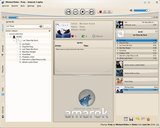
As noted a few times before, the graphical theme of Amarok is still evolving. However, with each release we're slowly getting to the final design. Let us highlight some important points of Amarok's new theme:System color scheme awareness
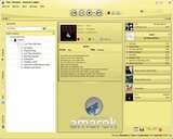
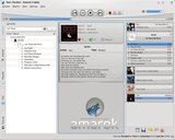
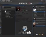
Probably the single most important feature is the ability to adapt to the system color scheme, completely. Check it out: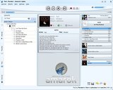

Scalability
No more bitmaps graphics! Every aspect of Amarok's artwork is vector based. No matter what size your display is, Amarok will look crisp and clear as never before.Cool volume and progress sliders
You might remember the excitement that followed the introduction of the custom volume widget in Amarok 1.4. With the introduction of the new theme, it's time to show matching volume and progress sliders:
Don't they look lovely?
Album art watermarking
To distinguish tracks coming from different sources (local collection and various online services), Amarok displays a little service logo in the corner of the album cover.It's unsure whether this feature will stay, so please add your feedback!
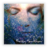
The same icon is also displayed in the status bar. Consistency is good :).
Apart from the theme shown above, developers and artist are experimenting with the new theme, which more closely reassembles the look of the original Amarok 2.0 mock-up. You might hear more about it later, but for now enjoy those highly preliminary screenshots:


Context View mechanics
Amarok's Plasma-powered Context View (also known as "empty space in the middle of the window") recently got a functionality boost. It shows various, nicely shaped, current track related "applets", and automatically manages their layout. For now, the available applets are:Track info
Provides classic "currently playing" information: tags, album art, play count, track score and ratings.
Lyrics
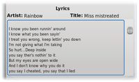
Displays lyrics for the current track. Equivalent to the "Lyrics" tab from Amarok 1.4
Service info
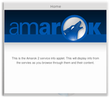
Displays information provided by the currently used Internet Service. Magnatune store has some cool uses for it (we'll get to that later), and idle Amarok shows this:
Wikipedia
Fetches artist, album or track information from Wikipedia. Replaces "Artist" tab from Amarok 1.4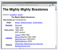
Last.fm events
Displays upcoming Last.fm events for your account. Now with a custom settings dialog.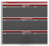


Cloud View
The cloud view is meant to present tags from different services (Magnatune, Jamendo, Last.fm) in a cool and fashionable way. For Magnatune (which is the only place it works, at the moment), the idea is that clicking one of these tags will load 10 random tracks tagged with this mood into the playlist. Along with the new service-specific buttons ("Find in service" and "Buy", covered later), this will provide a powerful new way of exploring the Magnatune catalog of music.
Web services at work
One interesting new feature of Amarok 2.0 is the Service Framework, which allows easy integration of online music services with Amarok. Have a look at the power it brings to developers:Custom browser
It's possible to create a completely custom service browser, which is used for adding music to the playlist. For example, the Last.fm plug-in offers complete personal account access, as well as selecting the radio station, and custom buttons. Magnatune on the other hand provides a browsable and searchable music catalog, with the ability to buy selected albums.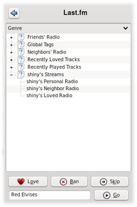
Main toolbar integration
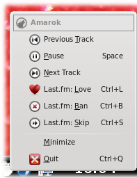
All services can provide custom buttons which will be displayed in the main toolbar, alongside the playback control buttons. When playing a Last.fm track, Love|Ban|Skip buttons appear, while Magnatune.com displays Buy Album and Find Artist buttons.This also applies to the icon tray context menu:
Service information area
Every service can show its custom information in the Context View. For example the Magnatune service features a welcome screen with introductory text and a list of the latest available albums. Clicking any of the albums shown here loads the album into the playlist, complete with album art and the options to directly buy or download it, or to open the Magnatune service with the artist of one of the albums selected, for easy browsing of other albums by the same artist.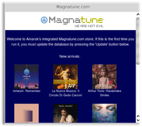
Scripting
The Services framework actively supports scripting. In fact, it's possible to create custom services using only scripting languages. You can start and stop scripted services via Amarok's Script Manager, and they appear in the Internet tab, like any other service. For example, Amarok ships with a SeeqPod service script, which provides access to SeeqPod's database with just over one hundred lines of Ruby code (including comments!).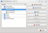


Phonon integration and it's consequences
Phonon is KDE's new and shiny multimedia layer, which makes audio and video easy on all platforms. After years of using multiple custom "engines" for playback, the Amarok developers decided that Phonon is good enough to replace the old infrastucture. Amongst other benefits, it results in substantial code simplification. So, from now on, Amarok no longer offers engine selection but uses Phonon directly.Discussing Amarok menus under OS X
Illogic-al posted a summary of his work getting Amarok to integrate better with the Mac OS X menubar:On OS X all application menus live in the menubar. It's the thin bar along the top of the screen in all those OS X screenshots you see.
All applications also have what is referred to as the "Application menu" and then the actual menu entries for the application.
The "Application menu" gets it's name from the name of the app it is displaying. In the case of Amarok this results in duplicate menu items named "Amarok".
Amarok Amarok Playlist Mode Tools Settings Help
is the resulting menu setup. Quite confusing. To rectify this I've renamed the second Amarok entry Playback, as it refers to entries that have to do with playback. This gives us
Amarok Playback Playlist Mode Tools Settings Help
The Mode menu entry only has two items, and honestly doesn't really make much sense all by itself (Mode of what?) so I removed the playback mode entries, and put them in the Playback menu.
The result is now:
Amarok Playback Playlist Tools Settings Help
The Application menu (labelled Amarok by the OS) also has some standard entries. One of these standard entries is the Preferences. Qt, through some string replacement black magic takes Settings -> Configure Amarok... and converts it to Amarok -> Preferences. This does two things. First it puts the entry in a location where OS X users expect there application preferences to be, second it gives it a shortcut that OS X users know will automatically take them to the applications preferences.
(...)
The one things that is left outstanding is whether or not to include a "Window" menu entry. This is required by Apple HIG and contains required entries such as Minimize, Zoom (basically Maximize) and allows access to other window which may be opened up by the application. The problem with this is that those entries in Amarok already have a menu. It's called Tools. Personally I'm ambivalent on the following of the HIG. But if we want to properly integrate into OS X, i think it's something we should do.
He added later on:
And all the changes I've made here are all special cases only for OS X. None of these changes will show up in Linux/Windows versions.
Take a look at the resulting screenshots:
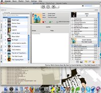
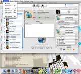
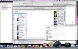
Amarok 1.4.9 (stable) released
Amarok 1.4.9 has been released. Among other fixes it features corrected Amazon album art download and updated translations. Get it here.Amarok 2.0 feature freeze, first Alpha
Amarok 2.0 is entering feature freeze, which means developers are determining the final feature set. When all outstanding issues are resolved the first Alpha version will be released, after which no new features are going be introduced. Don't worry if your favorite feature won't cut for the version 2.0.0, as it'll be the very first release in a probably quite long series, with lots of functionality added on the go :). Expect an Alpha announcement soon.
Amarok at FOSDEM, Bruxelles, Belgium
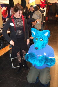
As last year we shared a booth with the KDE project at FOSDEM in Bruxelles. We had several machines with up to date SVN builds with us. Those were still pretty unstable, which changed a lot for CeBIT some days later, but good enough to show what we are currently working on. Those were also the days our mascot Mike had its first public appearance.
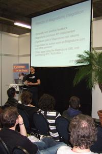
On Saturday Nikolaj gave a talk about Amarok 2 in the well visited KDE devroom. He also gave a very similar talk at OpenExpo, where it was recorded on video.
Amarok at CeBIT, Hannover, Germany
For the first time ever we took part in the worlds largest computer expo: CeBIT in Hannover. For six days we showed an interested audience what hopefully will be Amarok 2 in a few months, but of course we also had a stable version with us, including nearly all available features. We didn't count the visitors but we nearly lost our voices from talking the whole day and sold all the shirts we had with us. Many thanks go to Linux New Media who sponsored the booth.There were also several talks you might be interested in: on Saturday Sven showed the audience Amarok 1.4.8, answered questions and gave an overview of the development that took place in trunk. Also on Saturday there was a talk by Franz Keferböck about KDE 4. Those, and all the other talks, are available for streaming. But be warned, the talks were done in German.

Amarok at OpenExpo, Bern, Switzerland
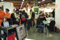
This March, Project founder Mark Kretschmann and Nikolaj Hald Nielsen, one of our main developers, went to Bern to man a booth at Open Expo. They got to talk to a lot of Amarok users and potential new users, had a few technical discussion and went out for beer with Alan Cox (one of the core Linux kernel hackers), who turns out to be a really nice and fun guy.
Nikolaj: As is unfortunately most often the case when manning a booth, I did not get to go see many talks myself. I did get to give one of my own though (which was also the main reason I flew in from Denmark). The talk (which incidentally is the same one I gave at FOSDEM) is called "Amarok2 – in the intersection between free software and free culture" and slides can be found here and a video (unfortunately with very bad sound quality) can be seen here: here.
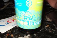
Oh, and they had "Free Beer" which is of course really good stuff! :-)
Upcoming Amarok events
If you want to see the latest Amarok snapshots and if you are too lazy to compile them yourself, you can have a look at them on several events. The Amarok team will take part in Open Source Expo in Karlsruhe, Germany on May 25th and 26th and also in LinuxTag in Berlin, starting two days later. As always we will have merchandise, our mascot Mike and several highly motivated Rokymoters with us. Maybe we will also have talks there, but the conference schedules are not yet finished. Amarok for Life: Rok the Wall
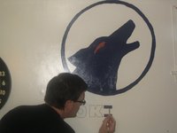
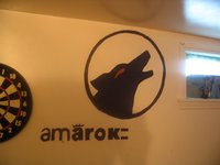
After Amarok developer Markey demonstrated his craziness, it's time for the second geek to enter the show. We prepared a short interview with Jeremy Bernhardt from from Melville, Canada, who painted the Amarok logo on his wall!
Could you introduce yourself?
My name is Jeremy Bernhardt from Melville, Saskatchewan, Canada and I'm a grade 9 student who use GNU/Linux to do anything from assignments to relaxing.
In my free time i'm helping others with computer issues (Im the go-to guy :-).
How and when did you find out about Amarok?
I found out about Amarok in December 2007 when I installed Kubuntu (kubuntu-desktop :-) on my Ubuntu 7.10 machine.
We heard you did something crazy. Could you describe it a bit further?
My sister and I were creating a room to chill in when we decided to paint the walls with cool things! My sis (being a dog lover) wanted a wolf on one wall. I however wanted something Linux related. Then it hit me AMAROK! A little time and paint later we had achieved our goal.
Did you know Markey tattooed Amarok logo on his arm?
No, I didn't, But after Googling it (he apparently doesn't read Insider. Release the sharks!) I have one thing to say:
DUDE! Way to show your love of Amarok!
What do you think is the next thing we'll see the Amarok logo painted on?
Either a garage door, graffiti'd on the side of a building or on a vehicle.
Any extra comments?
Just three:
1. Amarok is the best media player in the history of man! It was the one sole app that made me switch from Ubuntu to Kubuntu (I reinstalled :-)!
2. Thank all of you who donated your time, money or mad hacking skills to Amarok! without you this project wouldn't be alive!
3. Thanks to Nightrose (Amarok community manager) who passed this along!
For more pics go to Jeremy's Picasa web album.
OK, two geeks gone, more to come. We're waiting for your submissions! Write to us at amarok@kde.org with the topic "Amarok for Life".


Comments
Watermark
Please make the watermark optional, otherwise this could get annoying.
my voice
awsome but keep the icon optional
Watermarks
The watermarks are ONLY shown for content from the different services. This is done as it is the only way the visually distinguish between local content and, say, reviews being streamed from Magnatune. As tis content will have different options available to it ( i.e. you can purchase or download stuff from some services ) it makes sense to have a small notification that it is non local. The watermarks will not be shown for local content.
Almost everything looks
Almost everything looks amazing, except Context box which currently is our of sync. The text has misplaced marginals and just looks unorganized and ugly. Then we have the pause, stop, play and rewind buttons which looks awful if you ask me. It does not fit the environment at all, especially for KDE users. Volume bar itself looks great. BUT I think you could remanage it a little so it fits the curves. Now it just breaks out the amazing curve in the background. You must look for consistency in the layout and design.
Except that, I am a happy man! ;P
Good luck with everything.
I just hope the final design would do it :D
we're also not sure
We are unsure about the whole curves/volume bar thing. The curves might end up being removed or something.
ALL my albums have a local
ALL my albums have a local cover on my disk so that watermark is totally useless for me.
Please make it optional.
same here. But i find this
same here. But i find this feature useful anyway. Will be nice, if there will an option to manual/auto copying of fetched cover to album folder (if it is in a separate folder).
Of course, watermark should be optional.
Sorry for bad english.
Watermarks are not shown for
Watermarks are not shown for local tracks, only for tracks from special services like magnatune, jamendo or last.fm
I guess for most people >90% of files are local
So you could just not show any watermark for local content, but display something for online, network etc. as default.
Wrong assumption
Wrong assumption 2
and a lot of people don't have access to broadband connection (yeah, really)... it's a good thing that Amarok is looking to the future but it should not reject all the users that can't use all the goodness from Internet
Broadband
Well, even if the assumption
Well, even if the assumption is wrong, in the near future there will still be some significant content locally and if it's local I also see it at first glance, because there is no watermark. I think at the moment the most natural assumption is that files are local and therefore no watermark would naturally be connected with local files. But even if this is only the default, you could make it configurable so people that use 90% online content could make that their default without watermark.
Terrific
I haven't checked in on Amarok's progress in a few months - I'm amazed how far 2.0 has come! Congratulations are due to all the contributors, I can't wait to give it a try.
Is the whole thing with the
Is the whole thing with the the thin curve and different-coloured area underneath it really going to stay into the final release? Having a consistent look between applications is one of my favourite things about KDE, and this just makes Amarok look different. Can it not just look like a normal KDE app - or at least make this optional?
Kinda
We definitely want to keep fancy SVG graphics in the final release, yeah. But not necessarily the graphics that you currently see. If we get something better, we'll use that.
Good artists are a very rare resource in open source.
Great work on Amarok 2. I
Great work on Amarok 2. I have to say I was hesitant to see the radical change in UI, but the more I see the improvements, the more I am convinced that this was a move for the better. One of my favourite features of Amarok was that the context sidebar could be themed. Is it possible to use different themes for the Plasma applets which replace that view? Secondly, if Amarok uses special SVGs, will the app provide an easy way to replace those with other themes (I appreciate that the theme picks up system wide colors, but I'd prefer if the artwork itself could be customized) such as the tabs on the left?
Theming, no thanks
It's a strange point of
It's a strange point of view, very far from the general direction of open source software I think. The way it looks on the desktop of others should'nt concern the developers too much as soon as the user like the way it is.
Vision
Wow
That's what I call a good set of arguments.
I have to agree, I just love
I have to agree, I just love all the new Amarok's features but it breaks the consistent look that the old Amarok had :-/. Morehover, it is clearly designed to be shown in a big sized window and the big space in the middle, although it could be very useful (and cool !), should be easily hideable.
One more thing about the curved line, they seems to me (especially the one in the plasma space) a little bit too bended and give me a feeling of tension (you know, like an elastic rubber band near your eyes <__<)
well, this issues have already been discussed so I will try to enjoy Amarok nevertheless
Keep the good work Amaroker
valuable space lost
open the picture "12-colors1.jpg" and look at the left side of the picture where the songtitles of the Album "Let There Be Rock" are standing.
The white space between the songtitles and the coloured left border of the window is too big! The songtitles has to be displayed more on the left side, because now valuable space lost. (it is the same problem in older Amarok versions)
BTW: I can't see any benefit of "Album in watermarkinging". Will Amarok chance the picture-file or just display these watermarks only in Amarok?.
I copy these Album-pictures to my also mp3-player and do not need any watermark at the mp3-player display.
Thanks
cat
Context view
First of all: Great work. I'm really looking forward to the final version. Already moved to KDE 4.0.3 but I'm still using the old Amarok.
Regarding context view I'm not yet convinced that not having tabs is a good idea. After all, I now use it to see related tracks and artists info from last.fm in my collection, see all the albums/songs from the currently playing artist in my collection, read the lyrics and sometimes read some stuff on wikipedia. I expect that sooner or later all these features will be implemented as plasmoids in Amarok 2 and I will want to use them again plus I'm sure there will be other nifty new options.
Now that they're organized as tabs it's not really a big deal to overlook them, but each tab now already uses 1-10 times the screen size (depending on how many albums of that artist I have etc.). I'm afraid it will be quite impractical to have all this squeezed into one little context view field.
Are you planning on giving the user the possibility of adding tabs to his context view?? I think that would be a good idea.
Menu changes
To me Illogic-al's menu changes make so much sense on all platforms and I'd be quite happy if they were generally adopted in amarok. I am still on 1.4.6/1.4.8 but I can never find anything ion the menus. Cut to mental process: "Umm, engage - what does that do again ? What is the mode again ? Which of the menus do I need if I just want to start playing - is it playlist or mode or ..... ?"
Make it so
Menus
Seeing those nice menu changes, I was a bit disappointed to then read that this is only restricted to the OS X version. I think those changes would make a lot of sense on the other platforms as well.
Any chance we also get the reworked menu structure on Linux?
See below
Vertical Tabs
How about getting rid of these horrible vertical tabs? IMHO this is one of the worst user interface elements ever invented. I mean, by now I got used to it in Amarok, but I remember when I started using Amarok some years ago, I had a hard time using them... I think something in the style of the iTunes sidebar would be a lot easier to use.
Nope
Usability
I don't doubt that they are space efficient ;) But for the usability part ... I'm no usability expert, but I honestly doubt that this is just me. Simply because most of the world is used to read horizontally. In fact I think a usability study might be interesting here. I'm thinking especially about new users. Having used Amarok for a few years now, I got used to it as well. But try using an app that you have never used before, which uses vertical tabs and where you're not familiar with the interface: you always have to rotate your view or even your head to be able to read the text and you can't just naturally grasp it.
Also now many things which are actually top level are hidden behind the tabs. A sidebar would allow to add more than just 4 or 5 places, e.g. serveral collections, playlist, radio stream, podcast or jukebox... This means having things more visible and in the face and the user is less needed to switch tabs. When I was new to Amarok I found myself often clicking erratically through the tabs until I found what I was looking for. Another thing is that the tabbar is the major entry point to the music sources, however visually it falls off, being so slim and at the edge.
I admit though, that replacing the tabs by a sidebar or something might mean a major redesign of the interface, for the space issues you mentioned ...
just my 2 cent :)
Many apps use vertical tabs
Many KDE applications (such as KDevelop, Konqueror, and Kate) use vertical tabs. I won't argue for or against their "usability" but I just thought I'd emphasize than Amarok is in good company.
They are bad...
They're just as bad in KDevelop and Konqueror! Sideways text was never going to be a good solution. I just remember the positions/icons.
Amarok as a media handler?
Hi,
First of all, thanks for Amarok!
Secondly a question :-) I tried searching for information around it but did not find any.
Has there been any discussions regarding Amarok as a complete media handler for mobile devices? Currently it works well for my family with audio. The only issue being transcoding of audioformat is for engineers and not kids :-)
Lately more and more players can handle video and images as well as audio. It would be nice to have Amarok beeing able to handel content copying/transcoding to those units so tht the user does not need a number of different media applications. Any thoughts on that?
Kind Regards
Birger
Arendal
Norway
look
Nice work, guys and girls.
But I'd prefer theme without so much horizontal lines :-) For example two neighbouring lines in playlist needn't to be distinguished by color.
Keep up good workl
Playlist features? - Smarter playlists?
before you do a feature freeze, could you please post what some of the new features for Amarok 2.0 will be - specifically playlists:
I'm interested in improvements in:
Playlist
Smart playlists (that somehow make sense of my music collection and make a playlist of similar songs that are let's say 8gig's in size)
Smart autofill playlists (kind of same concept, but faster and with less work to set up)
Cool ways to fill up Ipod's, or other mp3 players with music/music videos/videos?
Neat Ipod integration (better than it was in 1.4 )
Song management - I have 30 gig's worth of music, and I'm lost in it. I need some smart way to manage it.
Automatic fixing of Mp3 ID3 tag information - including adding missing cover art to the mp3 file.
Upsampling capabilities - to make crappy mp3 files sound better.
Could you please elaborate on these features before the feature freeze?
Thanks.
"Upsampling capabilities -
"Upsampling capabilities - to make crappy mp3 files sound better."
Is it possible to upsample music as well, to make crappy music better?
/me goes to upsample his dollar bill
Upsampling works within
Upsampling works within reason. (heard a non-amarok setup a few years back.)
I've seen (and heard) an upsampling setup (I think it was both hardware & software) first with the regular source file, then with the upsampled file.
On decent speakers you can totally hear the difference. It sounds "fuller". (I made my friend do a "double blind" study utilizing his gf arranging songs randomly with and without upsampling without telling me. I can totally hear the difference. I called out which songs were upsampled and which were not correctly)
I'm kind of wondering if that would make my 128k mp3 files sound better.
I agree. Please provide
I agree.
Please provide updates in Amarok insider 13 about playlist capabilites, and new features like "smart playlists".
Great job so far guys.
Visual idea
Can you add a theme that's Apple like.
Where the different windows are slightly separated from each other and the desktop shines through between the gaps?
I think that would look great.
Maybe add themes that use various amounts of the screen. Let's say 1/2 the screen real estate for when not browsing.
Second that: Please elaborate to changes of audio capabilities: upsampling, Mp3 tag cleanup, random playlists, smart playlists, sharing libraries across computers with different Operating systems. - what are the changes/new developments for Amaork 2.0
Great Job!!!
I hope by the fall semester we'll see Amarok on dorm computers in colleges everywhere, instead or in addition to iTunes!!!
Is buying DRM-free songs from Amazon integrated yet?
Will it support playing video/music video? (show in the playlists and just call up the appropriate application to handle it)
"Is buying DRM-free songs
Will be as soon someone writes Amazon service browser.
"Will it support playing video/music video? (show in the playlists and just call up the appropriate application to handle it)"
Amarok will play (internally, no need for external apps thanks to Phonon) any videos manually added to the playlist, but nothing more (no collection, stats, etc). At least that was the plan back in the day.
Phonon / Quicktime on the Mac
Does reliance on Phonon with a Quicktime plugin on the Mac mean that the Mac version of Amarok will only be able to playback the file types that Quicktime supports? If so, this is a major dissapointment. Quicktime can't properly handle the playback of flac files (which comprise most of my music collection). Have I misunderstood something?
Unfortunately yes, but I've
Skip button and last.fm
All looking lovely :-)
Should/could the standard Amarok 'next' button and Last.fm's 'skip' button be merged if last.fm is active?
By 'merged' I mean the last.fm button could replace the 'skip' button.
But how would you then
wide playlist like in amarok 1.x possible?
Looks cool. But will there be the option to get rid of that middle part for the plasmoids and instead get a wide playlist like in amarok 1.x with all track information side by side (track, title, artist, album, genre, year, type, length, bitrate, points and rating - and to sort the songs in the playlist with these criteria)?
I completely agree. I just
I completely agree. I just pile all my songs into one massive playlist and put it on shuffle - if I ever want a specific playlist i just queue up songs. A wide (or at least prominent) playlist for me is a must have feature. But regardless, keep up the great work! Amarok rocks!
Tags and conversion
Will it include automatic ID3 Tag Filling? I find that option in Amarok 1.x pretty useless since it takes time and doesnt really support mp3 at first.
I'd also love Covers and Lyrics to be written directly in the ID3
And what about File Convertion?? Some backups I have are in wma, etc. or bitrates I dont like, what I like is to keep my collection Super organized.
Dont get me wrong, amarok is wonderful but not flawless and I love the way you are going with Amarok2.
Amarok make me change my default OS to Linux and ina a future, from gnome to KDE4.
Moodbar integration?
Will the moodbar still be available in Amarok 2.0? I love it, especially with such a large progress slider: I can seek much faster like that :)