- 简体中文
- Polski
- Français
- Deutsch
- Español
- English
You are here
Issue 13
November 6, 2008 - 00:16 — ljubomir
Welcome to the 13th (good it's not Friday) issue of Amarok Insider. On this happy day we prepared for you:

And, just for fun, take a look how the Amarok's interface evolved during it's development:
Want more? Check out RaVI's fine Beta 2 screenshot tour. If you made some cool gallery too, let us know!
With the final version of Amarok 2.0 waiting around the corner, let's take a look at some of it's biggest features.
You can remove either of them by clicking the minus icon in the bottom left corner and selecting the particular applet you'd wish to remove:
Adding applets is just as easy. Click on a plus icon and select the applet:
When there is no enough space for the applet to fit into the current page, Amarok places it the next empty page. You can move between pages by using the arrow buttons or you can zoom out with the zoom button
  to see all pages at once:
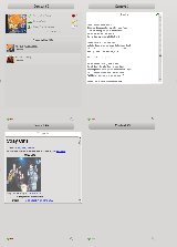
Clicking on any page will focus Amarok back to it.
We have so many nifty plans for the future, you can read some of them on the Leinir's blog.
Here are some mirrors in case you for some reason prefer high quality ogg file instead of a blurry Youtube.
Amarok Insider - Issue 13
Rok This TownWelcome to the 13th (good it's not Friday) issue of Amarok Insider. On this happy day we prepared for you:
- Release plans
- Final look for 2.0
- Context View
- The Playlist
- Brand new PopUp Dropper
- Web services unmasked
- A bit about Biased playlists
- Scripting
- Mac OS X and Windows installers
- Features missing in 2.0
- How to help
- Cool tips: Two rocks
Release plans
As you've probably noticed Amarok is currently in "release mode". We've released two alphas and three beta versions in the past few months, with the last beta released two days ago. Take your time and test it throughly so we can fix the remaining bugs for the final version which should be ready soon. Yes, you read it right, Amarok 2.0 is knocking to your door (although we may slip an RC or two ;)). If you're interested in helping out, we could use some regression testing.Final look for 2.0
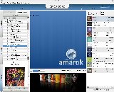
After many revisions of the Amarok look, we've finally settled on the theme used for the version 2.0. Thanks to the Nuno Pinherio and Lee Olson from the Oxygen team for helping with the artwork! Some minor tweaks remain to be done, but the general look won't change for 2.0. Any constructive criticism appreciated. This is how Beta 3 looks like:
And, just for fun, take a look how the Amarok's interface evolved during it's development:
 Original splash screen. Sparkled overly enthusiastic reactions. |
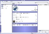 Beginnings of the UI refactoring. Central area still uses the old html engine. |
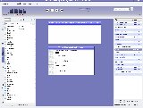 First version of the proper Context View. Later replaced by Plasma. |
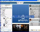 More work on the playlist. Still no plasmoids in Context View though. |
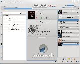 New artwork, working plasmoids. |
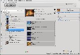 First beta. Amarok rocks. |
Want more? Check out RaVI's fine Beta 2 screenshot tour. If you made some cool gallery too, let us know!
With the final version of Amarok 2.0 waiting around the corner, let's take a look at some of it's biggest features.
Context View
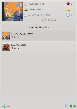
Central place of Amarok's window occupies the Context View, a Plasma powered information plane which displays all kind of useful information related to your music, like cover image, lyrics or ratings . Customizing it is a snap, as you can choose what information are you interested in form a wide selection of applets. All applets are grouped in pages, and you can manually assign applets to the pages, or let Amarok manage them for you. By default, Amarok shows one page with track information and albums by same artist:
You can remove either of them by clicking the minus icon
 in the bottom left corner and selecting the particular applet you'd wish to remove:

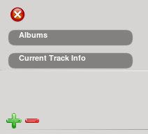
Adding applets is just as easy. Click on a plus icon
 and select the applet:

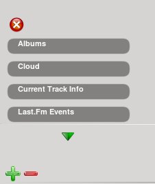
When there is no enough space for the applet to fit into the current page, Amarok places it the next empty page. You can move between pages by using the arrow buttons
 or you can zoom out with the zoom button
  to see all pages at once:

Clicking on any page will focus Amarok back to it.
The Playlist
Playlist widget in previous versions of Amarok with it's strict columns used a lot of horizontal space. In the new version it's replaced with a narrow bar which smartly combines much information yet still preserves space. Tracks from the same album are grouped together, and share cover image.We have so many nifty plans for the future, you can read some of them on the Leinir's blog.
Brand new PopUp Dropper
Due to the data (collection, web, files) browsers and playlist widget being on the opposite sides of the window, one could presume that dragging the music around will be much harder job than before. But thanks to the wisdom of the Amarok's developers that's not the case. Application detects when the user starts dragging and pops up a full sized menu which offers actions like "append to the end of the playlist" and "load and play now". Dropping the files on one of the menu entries triggers the appropriate action, hence the name "PopUp Dropper". This behaviour is very smooth and unintrusive, and can be completely ignored by dropping the files directly to the playlist. The following video demonstrates the usage of PopUp Dropper in Amarok 2 Beta 2:Here are some mirrors in case you for some reason prefer high quality ogg file instead of a blurry Youtube.
Web services unmasked
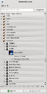
Another part of Amarok where much work has been invested is the Web services integration. Now Amarok can connect to various Web services and access the music from there directly, enriching your music collection greatly. And thanks to the powerful API adding additional services can be done with very little effort. This has been covered in the Insider on previous occasions, but now is a good time to have a look at what will actually make it into the final 2.0.0 release. Lets take a look at services supported by Amarok 2.0 Beta 3:Ampache Service
It allows you to connect to the Ampache music server and use it like any other service, which includes browsing, searching, cover art display, and of course music playback. This is really cool, as it allows you to have one centralised server holding your perfectly tegged collection, and use Amarok as a frontend remotely, which is, kinda, best of the both worlds.Jamendo Service
It gives you access to the Jamendo's rich database of independent artists.
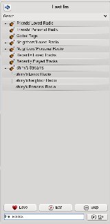
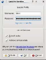
Last.fm Service
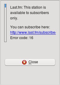
It's an advanced plugin which allows you to connect to the Last.fm web service. Via it's nifty inerface it offers a full access to the Last.fm's main features including those available for subscribers only. Besides usual ones like scrobbling and streaming it also has some nice little touches like special buttons on the toolbar and context menus.
Englisch
Stories:

